
The Problem with Gaana.com’s Identity
What is probably India’s most-used music streaming service, Gaana (“song” in Hindi), launched a new advertising campaign this month. It was very well executed with a great music video, beautiful typography and useful app demos at the end. Campaigns like these add to the brand value of a company — people see themselves dancing to songs on Gaana. But what’s missing here? What is the first thing users see when they download the app?
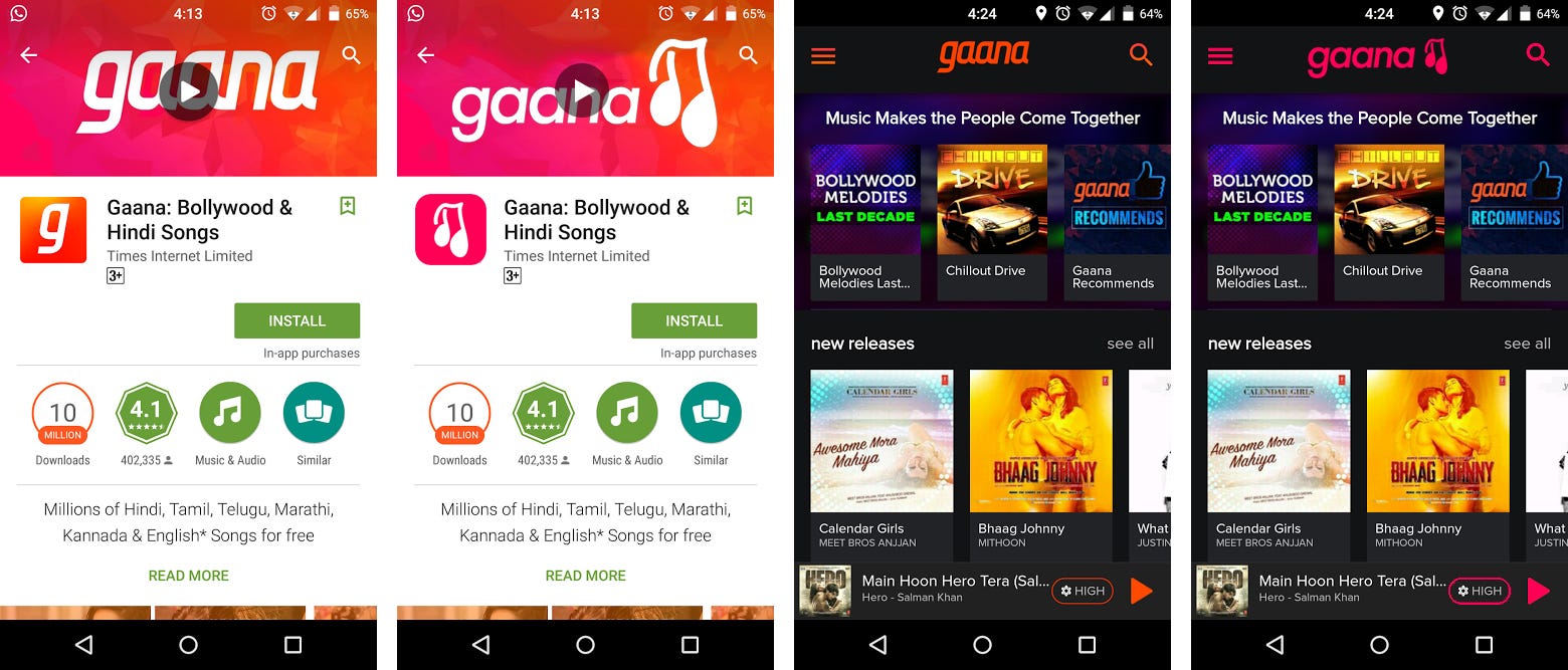
The purpose of this redesign is not to criticize Gaana’s current brand identity or focus on purely cosmetic changes, but since their product is now used by thousands, ideas that would have been impractical to implement can now be worked out. The problem with Gaana’s current logo is that people don’t connect with it. When you’ve lost your logo, that’s half the brand identity gone.

The problem is that the current Gaana identity doesn’t evoke emotion.
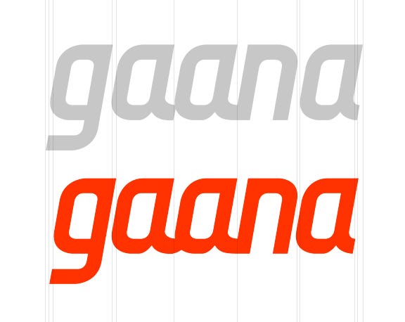
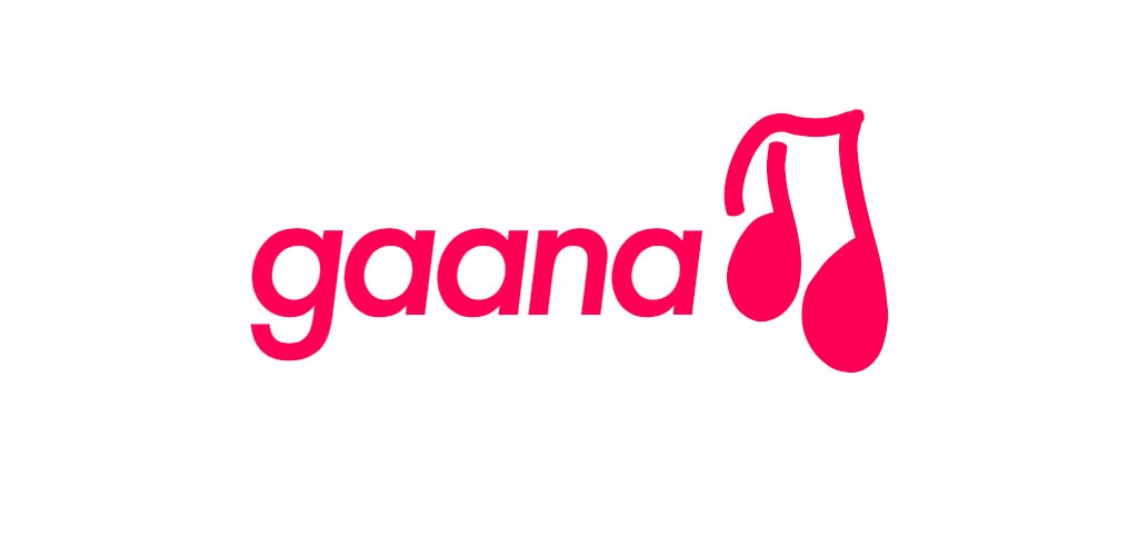
Their logo consists of a wordmark in a custom-designed typeface similar to Core Sans M, or the letter g in a rounded square. The tomato color sometimes seems oversaturated, but looks good when used in advertisement campaigns. The kerning, too, seems a bit out of place. The a-n ligature could be easily transformed into an a-a-n triple-letter ligature, which makes the first a seem less out of place.
The Solution
After kerning, the wordmark seems more aesthetically pleasing. The larger gap between a-a-n versus the smaller gap between g-a and n-a is compensated by the new triple-letter ligature.
That being said, the primary issue with their branding is not the kerning of the wordmark or the border radius of the icon. It’s purely in the user experience.
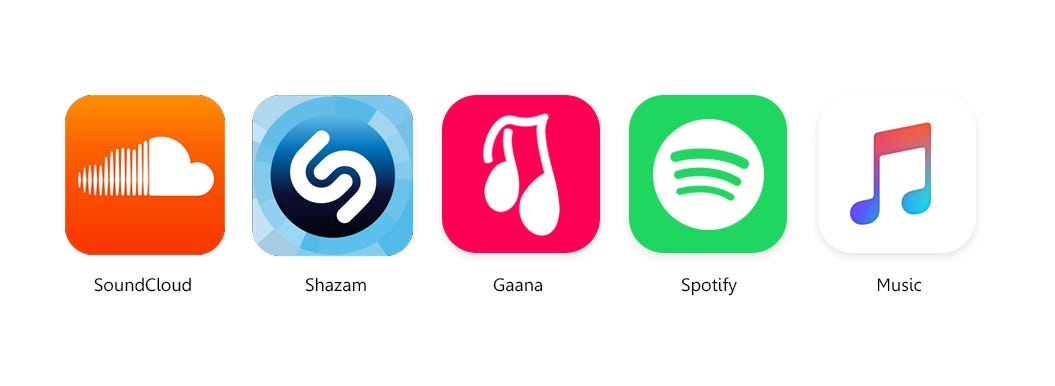
There are a variety of music streaming apps out there, and Gaana has to compete with giants like Spotify, Google Play Music and, more recently, Apple Music. The only way users will choose Gaana is if they connect to the app. Humans feel things. It is the user experience designer’s job to make users feel the right things.
What’s so special about Gaana, anyway?
Gaana is a Hindi word. When an Indian user hears “Gaana” and “Spotify,” they immediately connect with the former. Companies like Gaana need to learn how to use that to an advantage. Gaana has an exclusive collection of over a hundred thousand songs in regional languages like Marathi, Punjabi, Tamil, and Telugu, and languages with a larger following like Hindi and English. That’s their advantage over competitor apps.
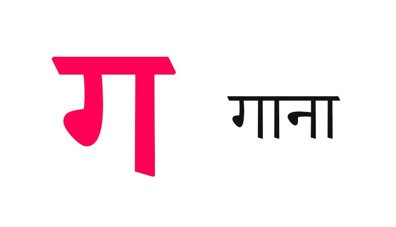
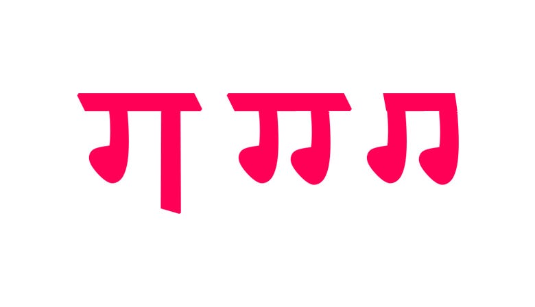
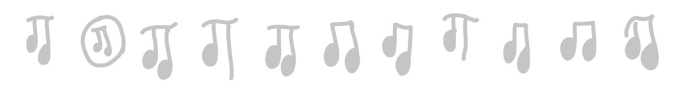
We evoke user emotion by the simple connection of gaana. Gaana offers thousands of Hindi and local songs, so why not use merely this for Gaana’s new identity? We’ll be able to increase Hindi-speaking users’ connection with the brand by simply using Hindi. It’s remarkably elegant. And, visually, the Hindi letter ga resembles musical notes. I think you can see where I’m going with this:
Wordmark
Gaana’s current custom-designed wordmark is that it is too unfriendly. Letters which are relatively smoother and more curved seem more friendly than those with extremely sharp edges.
I chose the typeface Futura by ParaType because it is beautifully geometric and has a forwardness appearance. The italicized font style also indicates motion in music, something I continued from the previous logo. The more circular g and a symbolize openness and harmony. All in all, the new wordmark looks like an evolved form of the previous one. For secondary uses, such as taglines in posters, etc., I recommend Brandon Grotesque.
Color
A new pink color was chosen as it successfully evokes VEVO, VH1, or Taylor Swift. It really feels like music.

Icon
Now let’s go back to the first paragraph, where I asked “What is the first thing users see when they download the app?” It’s the app icon, and its design is what is going to determine whether or not they will tap on it. So I fired up Autodesk SketchBook on my phone and started making designs using the brush tool, until I finalized one.
The New Identity
Note: Since this was only an early-stage idea I implemented in a few hours, I couldn’t design this icon as a vector. This is still a mockup.

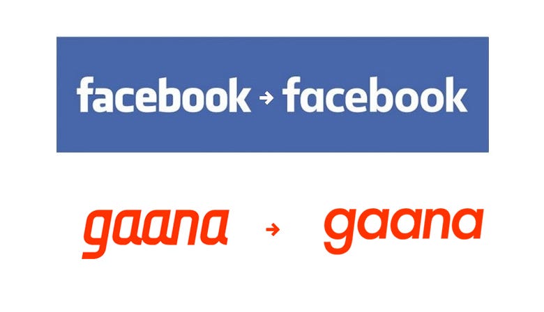
Current advertising campaigns can also be easily changed to incorporate the new brand identity.

I want the app icon to be more prominent that the wordmark, because people would not see the wordmark on their home pages when they have installed the app. It’s the app icon that matters.
The Gaana logo, advertising campaigns, and screenshots are properties of Gaana.com/Times Internet. This project is not associated with the said companies and may not reflect their plans for the future.