FirstQuadrant.ai
The FirstQuadrant website had one hard job: explain a fairly complex sales product before visitors bounced. The positioning changed as the product got clearer. We went from “All-in-one AI sales platform” at YC launch, to “AI sales execution platform,” and eventually to “Maximize B2B sales with human-centered AI.” That last line matched what we were trying to say in the product too: AI should help humans do better sales work, not replace their judgment.

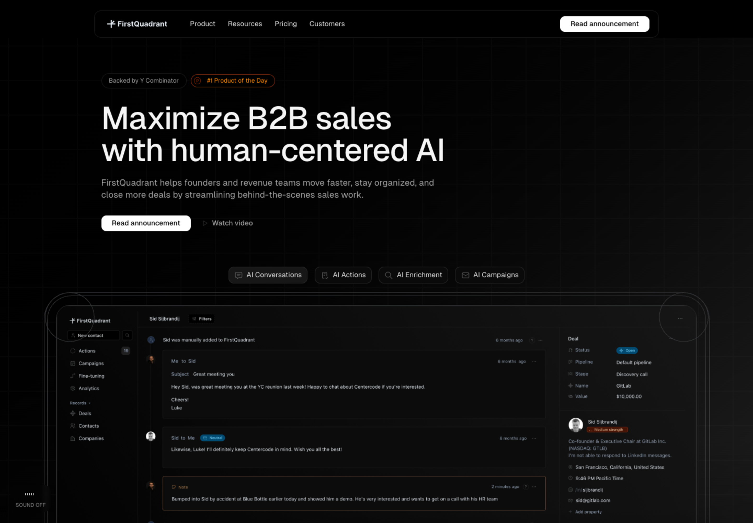
The final homepage led with the simplest promise we could make, then used motion and product screenshots to show what the platform actually did. The hero carried the YC and Product Hunt signals, a demo video, and an animated screenshot stack. A screenshot module let visitors switch between AI Conversations, AI Actions, AI Enrichment, and AI Campaigns, which mapped directly to the product surfaces we had built.
Below the hero, the site framed FirstQuadrant around three motions: Convert, Nurture, and Grow. Convert covered pipeline and deal work. Nurture covered reactivation and ongoing relationships. Grow covered top-of-funnel campaigns. That structure helped because the product was a loop: find contacts, enrich and qualify them, generate campaigns, review actions, and measure pipeline outcomes.


The interactive sections used normal sales scenarios: canceled meetings, positive replies, postponed conversations, competitor objections, and nurturing. The point was simple: FirstQuadrant read the conversation, understood the relationship, planned the next step, and kept following up.
Our YC Launch page leaned into personality: “This is the startup’s philosopher stone that turns lead into gold.” Founders who signed up within 48 hours got priority waitlist access.
The changelog became one of my favorite parts. We published weekly updates every Monday for over six months, including bug fixes. The consistency became its own kind of marketing.
Pricing and customer pages carried the more practical proof. Pricing had to make the AI-credit model understandable without turning the page into a spreadsheet. Customers showed who was already using FirstQuadrant and gave the site more social proof than a generic logo strip could.


We also built a documentation site powered by Mintlify, an API reference, and a free Deliverability Guide about email infrastructure. The site was the public home for positioning, docs, changelog, launch announcements, developer guidance, and trust-building.

The site supported dark and light themes, professional email validation, locale detection, animated product storytelling, and a performance-focused frontend. Built with Next.js App Router, Tailwind CSS, and TypeScript, it got the same attention to polish as the app itself, but the job here was marketing: make the product understandable, credible, and easy to explore.
Additional website view
